UX – Wire Frames
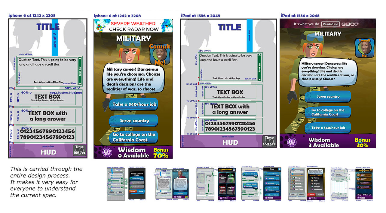
Requirements for this project were that each layout had to be designed for multiple aspect ratios from the tall iPhone 6 to the wide iPad. Each element would stretch between these two extreme sizes and everything in between.
Ultimately we implemented a clever system that had a fairly stable column in the middle of the screen and flexible backgrounds that made each display format look great.


